
The perfect white paint you saw on Pinterest might look like a flat, depressing gray once it hits your walls in Vancouver. It’s a frustrating reality for many homeowners in our corner of the Pacific Northwest. Do you feel overwhelmed by a sea of swatches, or maybe you’re worried that a bold new choice will look “muddy” under our frequent cloud cover? We understand that hesitation. You want your home to feel like a sanctuary, not a cave.
This guide highlights the top interior painting color trends Vancouver WA is embracing for 2026. We’ve curated a list of shades designed to thrive in our unique, cool-tinted light. You’ll discover how to use earthy neutrals like Sherwin-Williams’ Universal Khaki and deep, sophisticated tones like Benjamin Moore’s Silhouette to revitalize your space. We’ll also show you how to coordinate these new trends with your existing trim so you can move forward with total confidence. It’s time to stop second-guessing and start enjoying a home that feels brand new.
Key Takeaways
- Understand why Vancouver homes are shifting from cold, sterile grays toward warm, organic tones that create a sense of comfort and sanctuary.
- Learn how to navigate the “blue-gray” Pacific Northwest light to ensure your chosen interior painting color trends Vancouver WA don’t look muddy on cloudy days.
- Explore the 2026 palette of biophilic greens and earthy terracotta shades that bring the beauty of our local landscape right into your living space.
- Discover how “color drenching” and dark-painted ceilings can add instant architectural depth and a high-end feel to your bedrooms and common areas.
- Gain confidence in your project by learning how professional craftsmanship ensures bold colors are applied with the precision your home deserves.
Why Interior Painting Color Trends are Shifting in Vancouver WA for 2026
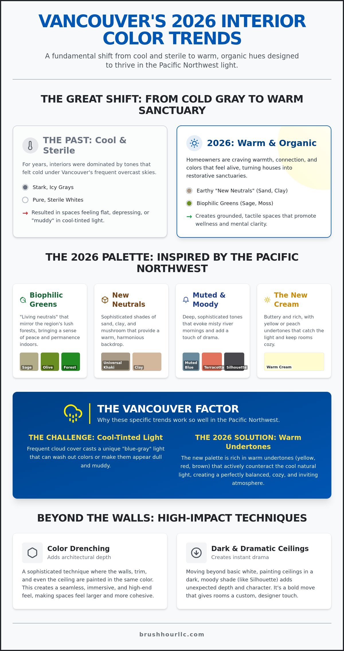
For years, Vancouver homes were dominated by “cool” tones. Think stark whites and icy grays. They were modern, sure, but they often felt a bit sterile under our frequent overcast skies. In 2026, we’re seeing a massive pivot. Local homeowners are craving warmth and connection. This shift toward “warm organics” isn’t just about fashion; it’s about how we feel inside our own four walls. Our homes are no longer just places where we sleep. They’ve become offices, gyms, and private retreats. We need them to feel alive.
What exactly is tactile color? It’s a shade that doesn’t just sit on the surface. These colors have visual weight. They feel like they have a history. This desire for the tangible often extends to the objects we use daily; to discover high-quality writing tools that mirror this sense of craftsmanship, visit HouseResort Stationery. When you look at a deep, earthy green or a soft mushroom taupe, your eyes perceive a sense of depth that a flat gray simply can’t provide. This depth is a core part of the interior painting color trends Vancouver WA is seeing this year. It’s a response to a world that feels increasingly digital and flat. We want our physical spaces to feel real, grounded, and substantial.
The End of the Neutral Era?
Is your home feeling a bit too “builder-grade gray”? You aren’t alone. Many people are moving toward what designers call “New Neutrals.” These aren’t the boring beiges of the 90s. We’re talking about sophisticated shades of sand, clay, and mushroom. These tones rely on foundational color theory principles to create harmony without being boring. They provide the perfect backdrop for the wood accents and indoor plants that define the classic Pacific Northwest style. These colors don’t fight with the light; they embrace it.
Emotional Design: Choosing Colors for Wellness
Your home should be your sanctuary. Biophilic design is the practice of bringing the outdoors in, and it’s dominating the interior painting color trends Vancouver WA homeowners are requesting. By using “earth-tethered” colors like mossy greens or muted terracottas, you create a space that feels grounded. This is especially effective in bedrooms where you want to wind down after a long day. Biophilic color palettes act as a visual bridge to the natural world, serving as a powerful tool for reducing daily stress and promoting mental clarity. It’s about more than just aesthetics; it’s about creating an environment that supports your mental health.
Choosing a new palette is an investment in your well-being. It’s about turning a house into a restorative home. When you step inside, the colors should tell you that it’s okay to relax. That’s the power of the 2026 trends. They aren’t just about looking good in a photo; they’re about feeling good in your life.
The 2026 Color Palette: Earthy Neutrals and Biophilic Greens
Ready to see the specific shades making waves? The interior painting color trends Vancouver WA is seeing this year are all about bringing the outside in. We’re moving away from synthetic-looking colors and toward pigments that feel pulled straight from the Clark County soil. These choices aren’t just about what’s “in.” They’re about creating a space that feels connected to the landscape we see every time we look out the window.
Deep Forest Greens are a major player in this year’s palette. These shades mirror the lush, evergreen canopy of the Gifford Pinchot National Forest. They provide a sense of permanence and peace that lighter colors often lack. If green feels too heavy for your space, consider Muted Blues. These aren’t the bright ceruleans of a tropical postcard. Instead, they reflect the soft, misty tones of the Columbia River on a quiet, foggy morning. They add a sophisticated touch of color without making a room feel cold or clinical.
We’re also seeing the rise of the “New Cream.” Say goodbye to the sterile, hospital-white walls of the past decade. The 2026 version of white is buttery, rich, and full of life. It has subtle yellow or peach undertones that catch the afternoon sun. This helps keep your rooms feeling cozy even when the rain starts to fall. It’s the perfect solution for homeowners who want a bright space that doesn’t feel empty.
Biophilic Greens: A Vancouver Staple
Why are sage and olive the go-to anchors for 2026 living rooms? It’s because they act as a “living neutral.” They provide enough color to be interesting but remain calm enough to live with every day. In areas like Battle Ground, we often see these greens paired with natural wood trim. The combination is timeless. To keep these rooms from feeling too dark, try using a higher sheen on the trim or keeping your ceiling a bright, warm cream. This reflects light back into the room, maintaining that airy feel.
The Return of Warmth: Terracotta and Ochre
Want to add some heat to your kitchen? Warm terracotta and clay tones are perfect for dining areas. They naturally stimulate conversation and appetite. If you’re worried about going too bold, balance these earth tones with neutral furniture in flax or oatmeal fabrics. According to Benjamin Moore’s 2026 Color Trends, these “spice” tones are essential for modern interiors. Think of the 2026 ochre trend as a “sunset in a can” for our long rainy days. If you’re feeling stuck between two shades, a professional painting contractor can help you see how these colors will actually behave in your specific home light.
Beyond the Walls: Trends in Trim, Ceilings, and Accent Textures
Do you usually think of your trim and ceilings as an afterthought? For a long time, the standard choice was simply “ceiling white” and a semi-gloss white for the baseboards. In 2026, that’s changing. We’re seeing a move toward more integrated, intentional spaces where every surface plays a role in the design. This shift is a major part of the interior painting color trends Vancouver WA is experiencing right now. It’s about creating a cohesive mood that wraps around you the moment you step into a room.
One of the most effective ways to add depth without adding clutter is through texture and finish. Even if you use the same color on every surface, you can create contrast by varying the sheen. A matte finish on the walls paired with a high-gloss version of that same color on the trim creates a sophisticated look that catches the light in different ways. This technique is perfect for monochromatic rooms where you want a subtle, high-end feel without the visual noise of multiple colors.
The Rise of Color Drenching
Have you heard of color drenching? It’s the 2026 trend of painting your walls, trim, doors, and even your ceilings the exact same color. While it might sound bold, it actually makes small Clark County rooms feel much larger. By removing the high-contrast lines between the walls and the trim, your eyes don’t stop at the edges. The room feels more expansive and immersive. It’s a specialized technique, so many people work with professional interior house painters to ensure the different surfaces and materials all take the paint evenly for a seamless finish.
Painted Ceilings and Architectural Interest
We like to call the ceiling the “fifth wall.” In Vancouver master suites, dark ceilings are gaining massive popularity. Imagine a deep charcoal or a warm, earthy beige above you as you drift off to sleep. It makes the room feel cozy and grounded. Beyond the aesthetics, using color on the ceiling is a clever way to hide imperfections in older homes where the plaster might be less than perfect. According to these 2026 paint color trends, moody darks and creamy neutrals are leading the way for these overhead transformations.
If you live in one of Vancouver’s older neighborhoods, you might be debating whether to paint your original wood trim. It’s a big decision. While natural wood is a staple of PNW style, painting that trim can instantly modernize a space and make it feel fresh. If you choose to paint, don’t forget the crown molding. Carrying your wall or ceiling color onto the molding can make your ceilings feel a foot taller. It’s a simple trick that yields professional-looking results every time.
How Vancouver’s Unique Light Influences Your 2026 Color Choices
Ever wonder why that beautiful beige you saw in a magazine looks like dirty dishwater on your living room wall? It’s a common frustration for homeowners in our area. Vancouver’s light is unique. We deal with over 160 cloudy days a year. This diffuse, blue-gray light acts like a cold filter. It sucks the life out of colors that were designed for the constant sun of California or Arizona. When you’re looking at interior painting color trends Vancouver WA, you have to account for this “cool” cast. While the sun-drenched aesthetics favored by premier designers like Beverly Hills Luxury Interiors provide incredible inspiration for high-end residential spaces, those palettes must be thoughtfully adjusted to maintain their warmth and depth in the Pacific Northwest.
A color that looks like warm sand in San Diego often looks “muddy” or greenish in Battle Ground. This happens because our light doesn’t have the same red and yellow wavelengths found in sunnier climates. To fight this, you need to look at the Light Reflectance Value (LRV) of your paint. LRV is a scale from 0 to 100 that measures how much light a color reflects back into the room. For our dark winters, choosing a value above 60 is vital because it keeps your space from feeling like a cave. It helps bounce what little natural light we have around the room, keeping things bright and airy.
The ‘North-Facing’ Challenge
Rooms that face north are the hardest to get right. They never see direct sunlight. Instead, they get a steady, weak, blue light all day. If you put a cool gray or a crisp blue in a north-facing room, it’s going to feel chilly. You’ll literally want to turn up the thermostat. To fix this, lean into the “warm organics” we discussed earlier. Choose colors with yellow, peach, or pink undertones. These pigments “grab” the available light and bounce warmth back at you. It makes the room feel inhabited and cozy even on the rainiest Tuesday in November.
Natural Light vs. LED: The 2026 Lighting Shift
Your choice of light bulbs is just as important as the paint itself. Modern LEDs come in various “color temperatures.” A “daylight” bulb is very blue, while a “warm” bulb is very yellow. Have you noticed how your walls look perfect at noon but turn a strange shade of purple at 4:00 PM? That’s called metamerism. It’s the effect of different light sources changing how we perceive color. This is why you should always paint a 2×2 foot test patch on different walls. Watch how the color shifts from morning to night before you commit to the whole room. If you want to ensure your palette works in every light, connect with a professional painting contractor who understands how local environmental factors impact your home.
Bringing 2026 Trends to Your Home with Professional Interior Painting
You’ve seen the palettes and understood how our local light changes everything. Now comes the most exciting part: the actual transformation. While it’s tempting to grab a roller and spend a weekend DIY-ing, the interior painting color trends Vancouver WA is embracing for 2026 require a steady hand. Bold, earthy tones and deep biophilic greens are stunning, but they are also unforgiving. Every lap mark or uneven coat stands out when you’re working with the rich pigments and matte finishes that define this year’s look.
Why is professional prep so important right now? It’s because matte finishes are the gold standard for 2026. They provide that soft, velvety look that makes a room feel high-end. However, matte paint doesn’t hide imperfections; it highlights them. If your walls aren’t perfectly smooth, the paint will show every bump and scrape. We focus on meticulous prep work, ensuring your surfaces are a flawless canvas before the first drop of color ever touches the surface. This is how you get results that last for years.
Precision Craftsmanship for Modern Palettes
Techniques like color drenching demand expert-level skills. When you’re painting the walls, baseboards, and crown molding in the same hue, the “cutting-in” must be razor-sharp. Any wobble where the wall meets the ceiling ruins the immersive effect. We take pride in that level of detail, ensuring seamless transitions between different finishes. If you’re feeling overwhelmed, reading up on how to hire a painting contractor can provide the peace of mind you need.
Start Your 2026 Transformation Today
Are you ready to stop looking at swatches? At Brush Hour LLC, we make the process simple. We’re your local experts who understand Vancouver neighborhoods and the specific challenges of PNW homes. We offer a straightforward, low-friction way to get a quote and start your project. We handle all the heavy lifting, from prep to the final walkthrough, so you can just enjoy the results. Our goal is to be a supportive partner in your home’s revitalization.
2026 is the perfect time to invest in your property’s interior. A fresh coat of paint is one of the most cost-effective ways to boost your home’s value and your own daily happiness. Your home should be a place that fills you with energy and peace. Don’t wait another season to make it happen. Reach out to us today, and let’s talk about how we can bring these beautiful new trends to life in your space. Your home deserves to feel new again.
Ready to Transform Your Living Space?
Choosing a new palette is about more than just picking a color from a book. It’s about understanding how the mist over the Columbia River or the shade of our Douglas firs impacts the mood inside your home. You now have the tools to navigate the 2026 shift toward warm, earthy neutrals and biophilic greens. By paying attention to Light Reflectance Values and embracing techniques like color drenching, you can turn any room into a true sanctuary. Staying ahead of the interior painting color trends Vancouver WA is seeing this year ensures your home feels modern, cozy, and perfectly tailored to the Pacific Northwest.
As a locally owned and operated business, we take pride in helping our neighbors revitalize their properties. Our team is licensed, bonded, and insured in Washington, providing you with total peace of mind. We guarantee precision craftsmanship on every project, ensuring those bold 2026 colors look exactly how you imagined. Ready to refresh your home? Get your free interior painting quote from Brush Hour LLC today! We can’t wait to help you fall in love with your home all over again.
Frequently Asked Questions
What is the most popular interior paint color for 2026?
Leading the pack for 2026 are nature-inspired neutrals and deep, moody tones. Sherwin-Williams’ Universal Khaki and Benjamin Moore’s Silhouette are two of the most popular choices. These colors reflect the broader interior painting color trends Vancouver WA is seeing right now. They provide a grounded, organic feel that works beautifully with the wood and stone elements common in Pacific Northwest homes. It’s all about warmth and comfort this year.
How do I choose a paint color that won’t look dark in Vancouver’s winter?
You should look for colors with a Light Reflectance Value (LRV) above 60. This number tells you how much light the paint bounces back into the room. In our dark winters, you want a color that works hard to keep the space bright. Avoid cool grays and instead opt for “new neutrals” with warm yellow or peach undertones. These pigments help counteract the chilly, blue-gray light coming through your windows.
Is ‘Color Drenching’ a trend that will last, or will it go out of style?
While trends always evolve, color drenching is likely to stay relevant because of its architectural benefits. It creates a seamless, high-end look that makes a room feel intentional and calm. By removing the contrast between walls and trim, you simplify the visual space. It’s a sophisticated technique that homeowners in Clark County are using to make their interiors feel more like custom-designed retreats rather than standard houses.
Should I paint my trim and doors the same color as my walls in 2026?
Painting your trim and doors the same color as your walls is a fantastic way to modernize your home. This technique is a major trend for 2026 because it makes rooms look taller and less cluttered. If you’re worried about it being too monochromatic, you can easily vary the sheen. Use a matte finish on the walls and a satin or semi-gloss on the doors to create a subtle, elegant contrast.
Does interior painting really increase home value in Vancouver, WA?
Yes, a fresh interior paint job is one of the most effective ways to boost your property value. It signals to buyers that the home has been well-maintained and is move-in ready. In our local market, choosing the right interior painting color trends Vancouver WA buyers love, like warm off-whites or soft earth tones, can make your home feel larger and brighter. It’s an investment that yields a high psychological and financial return.
What is the best paint finish for high-traffic areas like kitchens in 2026?
The best choice for 2026 is a high-performance, scuff-resistant matte or eggshell finish. These modern formulas give you the sophisticated, non-reflective look that is currently trending while being incredibly easy to clean. They are specifically designed to withstand the steam, grease, and frequent wiping common in busy kitchens. You get the beauty of a designer finish without sacrificing the durability your family needs for daily life.
How long does a professional interior painting project typically take?
A typical professional project for a few rooms usually takes 3 to 5 days. This timeline ensures we have enough time for thorough prep work, which is the secret to a long-lasting, high-quality finish. Larger full-home repaints can take a week or more. We always work methodically to minimize disruption to your daily life while maintaining our high standards for precision, organization, and cleanliness from start to finish.
Can I use 2026 color trends in a small bathroom or hallway?
Small bathrooms and hallways are actually the best places to experiment with bold 2026 colors like terracotta or deep olive green. Because these are transitional areas, you won’t grow tired of a strong color as quickly as you might in a main living room. Using a rich, nature-inspired shade in a small space creates a “jewel box” effect. It adds instant personality and warmth to your home without overwhelming your entire floor plan.