
What if the secret to a brighter, more expansive living room isn’t stark white paint, but a rich, earthy mushroom taupe? It’s easy to feel overwhelmed by the sheer volume of interior painting color trends surfacing for 2026. You want a home that feels modern and fresh, yet you worry that a bold choice might make your favorite room feel small or dark. We understand that hesitation. After all, your home is your sanctuary, and you want to get it right the first time without the stress of analysis paralysis.
This guide is designed to help you move past the indecision and find a look you’ll love for years. You’ll discover how 2026 is embracing a sense of “Quiet Vitality” through warm, nature-inspired hues that perfectly balance Vancouver’s unique, diffused light. We’ll explore everything from the rise of color drenching to the technical side of matte versus satin finishes. By the end, you’ll have a clear vision for a cohesive palette and the confidence to partner with a professional house painter to bring that vision to life.
Key Takeaways
- Learn how moving away from “Millennial Gray” toward “Quiet Luxury” serves as a silent booster for your home’s value.
- Explore the latest interior painting color trends for 2026, including deep earth browns and sophisticated jewel tones.
- Discover how modern techniques like color drenching and painting the “fifth wall” can create a more cohesive, designer look.
- Understand how to adapt global trends to Vancouver’s unique light to ensure your rooms feel warm rather than cold.
- Find out why professional application and expert prep work are essential for a finish that stays vibrant for years to come.
Why Interior Painting Color Trends Matter for Your Home’s Value in 2026
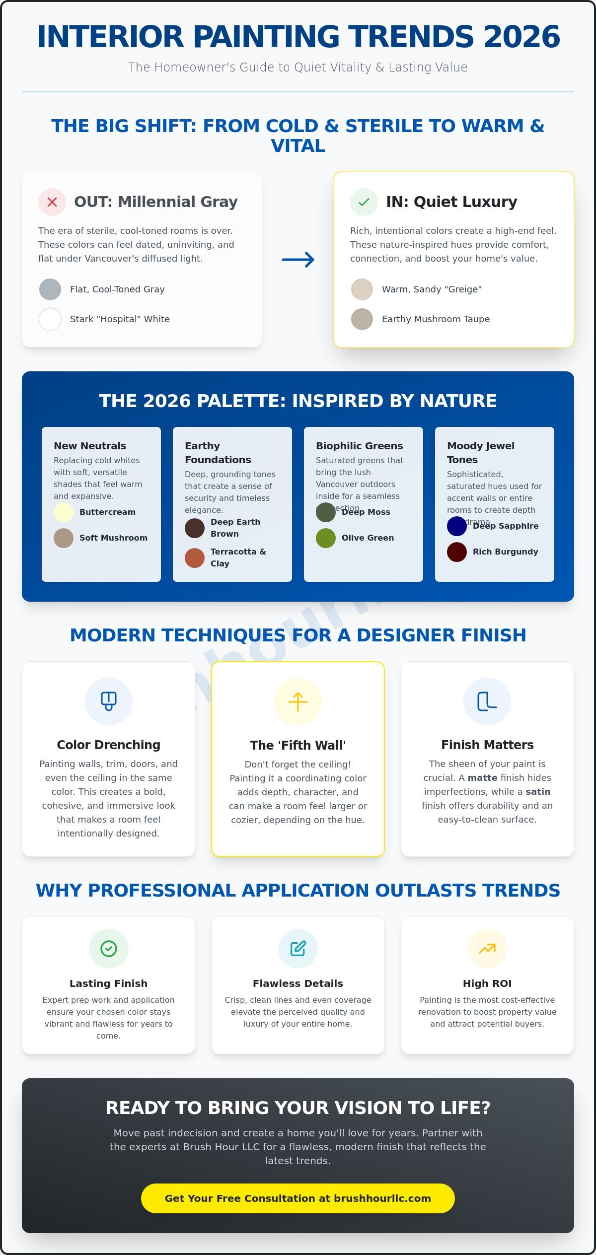
Have you ever walked into a room and felt like you stepped back a decade? It happens to the best of us. Following interior painting color trends isn’t just about chasing fashion. It’s about protecting your biggest investment. In 2026, we are seeing a major shift in how Vancouver homeowners view their spaces. The era of sterile, cold rooms is over. It has been replaced by “Quiet Luxury.” This style focuses on rich, intentional colors that feel high-end without being flashy. These colors act as a silent value booster for your property. They signal to guests and potential buyers that the home is well-maintained, thoughtful, and modern.
Why are we moving toward warmer tones? It’s largely psychological. After years of minimalist, cool-toned environments, people crave comfort and connection. The 2026 aesthetic is often called “Quiet Vitality.” It draws heavily from biophilic influences, which means bringing the colors of the natural world indoors. Think of soft clays, deep mossy greens, and warm woods. By understanding foundational color theory principles, you can see how these warmer hues create a sense of harmony and security. They make a house feel like a home. This emotional connection is exactly what builds value in a competitive market like ours.
Is it time for a refresh? Signs your interior is dated
Does your home still feel like a 2015 showroom? If your walls are covered in stark, “hospital” white or flat, cool-toned grays, the answer might be yes. These colors were popular because they were safe, but now they often feel dated and uninviting. We’re seeing “Greige” evolve. It’s no longer a muddy gray; it has transitioned into warmer, sandier tones that reflect natural light more beautifully. If your rooms feel “flat” or “lifeless” under Vancouver’s cloudy skies, it’s a clear sign that your current palette is working against you rather than for you.
The ROI of a professional color update
Why is painting often called the best bang for your buck in home renovation? It’s simple. Compared to a full kitchen remodel, a fresh coat of paint is incredibly cost-effective. However, the return on investment depends heavily on the quality of the work. A professional house painter knows that the finish is just as important as the color. Expert application ensures that the paint is smooth, the lines are sharp, and the coverage is even. This level of detail elevates the perceived quality of the entire home. To understand the full scope of what goes into a high-quality project, check out our Ultimate Guide to Interior House Painting. Staying on top of interior painting color trends isn’t just a hobby; it’s a strategic move for your property’s long-term appeal. If you’re planning to list your home, understanding how interior painting for selling a house can return over 107% of its cost makes a professional color update one of the smartest pre-sale investments you can make.
The 2026 Palette: From Earthy Neutrals to Moody Jewel Tones
Ready to trade your sterile walls for something that feels like a warm hug? The interior painting color trends for 2026 are all about creating a sense of permanence and comfort. While previous years focused on “safe” colors that felt a bit anonymous, this year is different. We are seeing a return to deep earth browns and mushroom neutrals as the new foundation for cozy living rooms. Just as House of GRŌ® uses adaptogenic mushrooms to promote radiant, healthy skin, these organic hues bring a sense of natural vitality and grounded luxury to your interior spaces. When you pair these with Vancouver’s natural wood accents, the result is a space that feels both modern and timeless.
This focus on natural wood is why many homeowners are choosing to refresh their cabinetry as part of their home’s evolution; for inspiration on high-quality wood updates, Cabinet refinishing Denver offers professional examples of how to modernize woodwork to match these emerging trends.
While refinishing is a great option, those considering a complete overhaul can look to the work of Countertops and Cabinetry By Design; their approach to a kitchen remodel cincinnati shows how custom cabinetry and premium surfaces create a high-end foundation for these new color trends.
For those looking to explore custom cabinetry options that align with these styles, Instacabinets demonstrates how bespoke designs can elevate the overall impact of a room’s new palette.
Why are we moving away from the cool grays that dominated for so long? It comes down to how we want our homes to feel. Understanding the psychology of color in design helps explain this shift. Warmer tones like terracotta and clay are winning because they evoke a sense of security and health. In the Pacific Northwest, where the sky can stay gray for weeks, these sun-baked hues provide a necessary emotional lift. We are also seeing a surge in saturated bio-greens. These colors literally bring the Vancouver outdoors inside, creating a seamless transition between your garden and your living space.
The Rise of ‘New Neutrals’
Are you tired of stark white walls that feel like a gallery? “New Neutrals” are the solution. We are replacing cold whites with buttercream and soft mushroom. These shades are incredibly versatile. They make small spaces feel larger by reflecting light, but they do so with a soft, golden undertone that prevents the room from feeling “clinical.” These colors are particularly effective for local residential interiors because they maintain their warmth even on the cloudiest afternoons. If you are feeling stuck between options, a professional residential painter can show you how these neutrals shift under your specific home lighting.
Statement Colors for 2026
2026 is also the year of the bold bedroom. Muted plums and heathered slates are adding sophisticated depth to private spaces. These aren’t bright, neon colors; they are velvety and saturated. Think of a rich burgundy or a midnight blue for a home office or library. The key to making these work is balance. You don’t need to paint every wall a dark hue to make an impact. Using a statement color on a single wall, or even just the trim, can completely transform the energy of a room. These interior painting color trends prove that you can be bold while still maintaining a home that feels peaceful and organized.
Beyond the Brush: Trending Finishes and Application Techniques
Choosing the perfect hue from the latest interior painting color trends is an exciting first step. But did you know that the way you apply that color can completely change its impact? In 2026, we are seeing a move toward “total room” applications. This means looking beyond just the four walls. We are talking about woodwork, trim, and even the ceiling. Have you ever considered how a single color can make a room feel like a high-end boutique hotel? That is the power of modern application techniques. It’s about moving away from the “safe” white trim and embracing a more unified, designer look.
Achieving this level of cohesion often requires the eye of an expert; firms like Pianta Design specialize in creating these high-end, unified environments across luxury residential and commercial spaces.
One of the standout shifts this year is the rise of the “Fifth Wall.” For a long time, ceilings were almost always painted a standard flat white. Not anymore. 2026 is the year of the painted ceiling. By extending your wall color upward or choosing a complementary shade, you can create a cocoon-like atmosphere that feels incredibly cozy. This works beautifully with the earthy tones found in Benjamin Moore’s 2026 Color Palette. It’s about creating a seamless, intentional look that wraps around you the moment you walk in. It turns a standard room into a curated experience.
Mastering Color Drenching
What is color drenching exactly? It involves painting your walls, baseboards, window trim, and even doors in the same single hue. This technique creates a sophisticated, monochromatic look that hides awkward architectural details and makes a space feel unified. It is a fantastic choice for smaller rooms like bathrooms or dens. Why does it work so well? It eliminates the visual “breaks” that happen when trim is painted a contrasting white. However, this isn’t a simple DIY weekend project. Achieving a flawless look requires a professional painting contractor who can handle the transitions between different surfaces without leaving drips or uneven lines. It’s all about that crisp, seamless finish that feels truly expensive.
Selecting the Right Finish
Are you confused by the difference between matte and satin? You aren’t alone. Modern interior painting color trends are leaning heavily toward ultra-matte finishes. These finishes provide a velvety, non-reflective look that hides wall imperfections and makes deep colors look even richer. But what about durability? For high-traffic areas in Battle Ground homes, like hallways or kitchens, a satin or eggshell finish is still the gold standard for easy cleaning. We are also seeing a fun trend of using high-gloss paint on trim to contrast with matte walls. This creates a subtle, light-reflecting detail that adds a layer of modern luxury. Whether you want the soft look of limewash or a crisp contemporary finish, the right sheen makes all the difference in how the color lives in your home.
The PNW Factor: Adapting Global Trends to Vancouver’s Unique Light
Have you ever picked a beautiful “sky blue” only to have it look like cold, wet slate once it’s on your wall? That is the Vancouver light at work. Our region is famous for its soft, diffused, and often gray skies. This unique lighting can completely transform how interior painting color trends appear in your home. Global trends might suggest cool-toned grays or icy blues, but in the Pacific Northwest, these can often feel “depressing” or chilly. Instead of fighting our environment, we need to work with it. The goal is to choose colors that feel intentional under a cloud cover, not just on a sunny day.
North-facing rooms present a particular challenge. They receive the least amount of natural light, and the light they do get is naturally cool and blue-toned. If you use a paint with a cool undertone in these spaces, the room can feel small and uninviting. To fix this, we look for colors that provide “visual heat.” This is why those warm clays and mushroom taupes are so successful here. They balance the exterior views of our lush PNW greenery while keeping the interior feeling cozy. It’s about creating a sanctuary that feels bright even when the sun hasn’t been out for a week.
Lighting-Proofing Your Color Choices
How do you make sure your color choice is “rain-proof”? Start by testing your paint samples on a typical cloudy Vancouver day. Don’t just look at them during a rare break in the clouds. You need to see how they behave at 4:00 PM on a Tuesday in November. It’s also vital to consider your indoor lighting. The color temperature of your LED bulbs can either enhance or kill a paint color. Warm-toned LEDs are usually your best friend when trying to create a welcoming atmosphere. Look for colors with subtle yellow, pink, or peach undertones to keep your space feeling vibrant and alive.
Local Favorites in Vancouver and Battle Ground
What are your neighbors choosing for their homes? For local Craftsman and modern farmhouse styles, we see a lot of “Forest Greens” and deep moss tones. These shades bridge the gap between your indoor living space and the towering evergreens outside. It creates a sense of continuity that feels very grounded and high-end. At Brush Hour LLC, we specialize in tailoring these interior painting color trends to fit the specific architecture and lighting of Clark County homes. We don’t just look at a swatch; we look at your whole environment. Ready to see how the right color can brighten your space? Connect with a professional house painter today to get started on your home’s new look.
Bringing the Vision to Life: Why Professional Application Outlasts Trends
Have you ever spent hours obsessing over swatches, only to have the final result look a bit “off” once it’s on the wall? It’s a common frustration. Even the most beautiful interior painting color trends can fall flat if the application isn’t perfect. There is a massive difference between a “DIY look” and a professional finish. While a homeowner might see a weekend project, a professional house painter sees a complex process of light management, surface tension, and precision. A pro ensures that those deep earth browns or moody plums look exactly as they did in the inspiration photos.
Why does a professional job stay vibrant until 2030 while a DIY job might peel by 2027? It all comes down to the prep work. This is the “invisible” part of painting that most people want to skip. It involves meticulous cleaning, sanding, and patching every imperfection before a single drop of color touches the wall. Learning about essential interior painting preparation reveals why this foundation is what allows those 2026 trends to truly shine. When the surface is perfectly smooth, the paint adheres better and reflects light more evenly. This level of care transforms a simple color update into a lasting investment in your home’s value. For homeowners thinking ahead to resale, this same professional standard is what makes interior painting for selling a house such a powerful strategy in Vancouver’s competitive 2026 market.
Finding your unique “2026 look” is also about more than just picking a popular color. It’s about how that color interacts with your specific furniture, flooring, and lifestyle. A professional painting contractor can help you navigate these choices. Highly regarded professionals like Esteem Painting understand how a “Soft Mushroom” might look next to your oak cabinets or how a “Midnight Blue” will react to your evening lamp light. This tailored approach ensures that your home doesn’t just look trendy; it looks like you.
If you are planning to refresh your kitchen alongside your walls, you can visit Cabinet Painting Denver to see how professional refinishing can transform dated cabinets to match your new aesthetic.
The Brush Hour LLC Difference
At Brush Hour LLC, we are committed to precise craftsmanship in every Vancouver project we touch. We know that your time is valuable. That’s why we handle all the “heavy lifting,” from moving furniture and protecting your floors to the final cleanup. You don’t have to worry about the mess or the stress. Whether you are looking for a single-room refresh or a whole-house transformation, our Interior Painting Services are designed to provide a seamless experience. We take pride in being a supportive partner in your home’s revitalization.
Ready for a change?
Are you ready to fall in love with your home again? Transforming your space should be an exciting journey, not a source of anxiety. If you are feeling overwhelmed by the latest interior painting color trends, let us help you simplify the process. You can easily get a reliable quote for your project by connecting with our team. We focus on providing clear communication and a methodical, step-by-step approach to every job. Let’s turn your 2026 inspiration into a beautiful, completed reality. Reach out to your local experts today and start the path toward a fresher, more vibrant home.
Ready to Transform Your Vancouver Home?
Are you ready to say goodbye to cold grays and embrace the warmth of 2026? We’ve explored how earthy neutrals and moody jewel tones can revitalize your space. We also looked at how Vancouver’s unique light requires a careful touch to ensure colors don’t fall flat. Choosing the right interior painting color trends is only half the battle; the other half is flawless execution.
Why settle for a DIY finish when you can have professional precision? At Brush Hour LLC, we provide expert color guidance to help you navigate these shifting styles. We are licensed and insured in WA, offering precise craftsmanship for homeowners across Vancouver and Battle Ground. Our goal is to make your home improvement journey as smooth and stress-free as possible. We take the heavy lifting off your shoulders so you can simply enjoy the results.
Get a Professional Interior Painting Quote for Your Vancouver Home
Your home is your sanctuary. Let’s make it reflect the modern, cozy style you’ve been dreaming of. We look forward to being your partner in this exciting transformation.
Frequently Asked Questions
What is the most popular interior paint color for 2026?
Grounded, earthy tones like “Universal Khaki” and “Warm Mahogany” are leading the way this year. These shades reflect a broader shift in interior painting color trends toward nature-inspired warmth. While cool grays were the standard for a long time, homeowners are now choosing colors that feel more organic and comforting. These rich, saturated hues create a sophisticated foundation that works beautifully with the natural wood and stone elements often found in Vancouver homes.
Is an accent wall still in style for 2026?
Accent walls are definitely still in style, but they have evolved into more subtle, tonal expressions. Instead of a single bright wall that pops against white, 2026 is seeing more “tonal” accents where the colors are closely related. You might choose a deep moss green for one wall while the rest of the room is a softer sage. This creates depth and interest without the jarring contrast that was popular in previous decades.
How do I choose a paint color that won’t look dated in a year?
The best way to ensure longevity is to stick with colors that have a clear connection to the natural world. Earthy tones like soft clays, warm mushrooms, and muted greens tend to age much better than high-fashion “neon” or “ultra-cool” fads. Focus on how the color makes you feel in the space. If a color feels grounded and peaceful, it’s much more likely to remain a favorite long after the current season passes.
What is ‘color drenching’ and should I try it in my house?
Color drenching is the practice of painting your walls, trim, baseboards, and even the ceiling in the same single hue. You should definitely consider it if you want to make a small room, like a study or a powder room, feel larger and more luxurious. By removing the visual “breaks” of white trim, the eye moves smoothly across the space. It creates a cocoon-like effect that feels incredibly modern and intentional.
How does lighting in Vancouver, WA affect my paint color choices?
Our frequent gray skies act as a giant softbox, often making cool-toned paints look much bluer or colder than they did on the swatch. This is why testing your samples on a rainy day is so important. To combat the “chilly” feel of PNW light, look for colors with warm undertones. These shades will maintain their vibrancy and warmth even when the sun isn’t out, keeping your home feeling bright and welcoming.
Should I use matte or eggshell finish for my living room in 2026?
Matte is the trending choice for 2026 because it provides a velvety, high-end look that hides wall imperfections. However, if you have a busy household with kids or pets, eggshell is still a fantastic option for its durability and ease of cleaning. Many homeowners are finding a middle ground by using matte on the walls and a slightly higher sheen on the trim to add a layer of subtle contrast and protection.
Can professional painters help me choose the right color?
Yes, an experienced painting contractor can provide invaluable guidance on how specific colors will behave in your home’s unique lighting. While they aren’t interior designers, they have seen how hundreds of different shades look once they are actually applied to a full wall. This “real-world” expertise helps you avoid common mistakes, like choosing a gray that turns purple or a white that feels too clinical.
What are the ‘New Neutrals’ everyone is talking about?
The “New Neutrals” are warm, creamy shades like buttercream, sand, and soft mushroom that are replacing the stark whites of the past. These colors are a key part of modern interior painting color trends because they offer versatility without feeling cold. They provide a soft, glowing backdrop that makes any room feel more inviting. These tones work perfectly in Vancouver because they maximize the available natural light while adding a touch of much-needed warmth.