
What if your favorite bold color actually makes your room feel larger instead of smaller? Most homeowners in the Pacific Northwest feel a bit of color paralysis when they think about interior accent wall painting. It’s completely normal to worry that a deep shade might turn your cozy den into a cave under our famous gray skies. You want that professional, high-end look, but the fear of messy DIY lines or a choice that feels dated can keep you stuck with plain white walls for years. We understand that your home should be a sanctuary, not a source of stress.
A strategic accent wall is the ultimate shortcut to a home that feels revitalized and intentional. You’ll discover how to pick the perfect focal point, like a fireplace or a unique architectural nook, and which 2026 color palettes thrive in our specific regional light. We’re diving into the latest design shifts, from the rise of warm, earthy neutrals to using the ceiling as a fifth wall. This guide provides the expert tips you need to ensure your next project results in a vibrant, professionally designed space you’ll love coming home to.
Key Takeaways
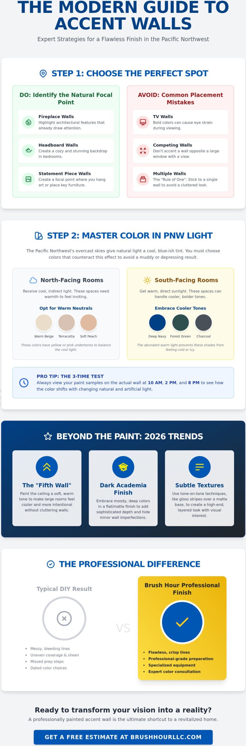
- Learn how to identify your room’s natural focal point and avoid placement mistakes that compete with your home’s architectural features.
- Discover why warm neutrals are the secret to successful interior accent wall painting under the unique, overcast light of the Pacific Northwest.
- Explore 2026 trends like “Dark Academic” matte finishes and subtle tone-on-tone textures that add sophisticated depth to any space.
- Get room-specific inspiration for creating a cozy anchor in your living room or a stunning backdrop for your primary bedroom.
- Understand why professional-grade preparation and specialized equipment are essential for achieving the flawless, crisp lines that define a high-end finish.
Choosing the Perfect Spot for Interior Accent Wall Painting
Where does your eye land when you step into your living room? Is it the fireplace, a large window, or just a blank expanse of beige? Choosing the right location for interior accent wall painting is the most critical step in your project. If you pick the wrong spot, the room can feel lopsided or cluttered. To get it right, we look for the natural anchor of the space. Successful interior accent wall painting is about more than just a pop of color; it’s about working with the bones of your home to create balance. While we focus on the Pacific Northwest, looking at the high-end projects of Kingdom Design and Build LLC can provide a great blueprint for how to integrate accent walls into a larger home aesthetic.
Identifying Your Room’s Natural Focal Point
Think about the architectural features you already love. A fireplace is a classic choice because it already draws attention. In a bedroom, the wall behind the headboard is the gold standard. But what if your room is just a plain, boxy square? You can create a focal point from scratch. Pick the wall where you intend to hang a large gallery or place a statement piece of furniture. To find unique, handmade pieces that can turn that gallery wall into a conversation starter, you can discover Art and Craft Expo and explore the work of talented artisans who specialize in creating one-of-a-kind home decor. This gives the room a sense of purpose it didn’t have before.
Be careful with the wall behind your television. While it’s a popular choice, a bold color can actually cause eye strain during movie nights. Instead, consider if another wall can serve as the visual anchor. Before you commit, it helps to understand What is an Accent Wall? and how it serves as a backdrop for your daily life. The goal is to highlight the best parts of your home, not to distract from them.
Symmetry and Balance in Wall Selection
Did you know you can use paint to “fix” a room’s proportions? If you have a long, narrow hallway or living area, painting the far, short wall in a darker shade can make the room feel more balanced. It brings that distant wall closer to the eye. This creates a more intimate feel in a space that might otherwise feel like a bowling alley.
In the Pacific Northwest, many of our homes feature vaulted ceilings and unique angles. Don’t be afraid of those heights. Painting a tall, angled wall can highlight the height of your home and make it feel more grand. However, you should generally avoid “competing” walls. If you have a massive floor-to-ceiling window with a beautiful view, that’s already your focal point. Painting the wall opposite it can feel overwhelming because the light will bounce off the color in unpredictable ways.
Stick to the “Rule of One.” In almost every case, you should only accent a single wall. Why? Because too many focal points leave the eye with nowhere to rest. One well-chosen wall creates impact; two walls often just create confusion. If you want to do something different for 2026, look up. The “Fifth Wall” or the ceiling is a major trend. A soft, warm tone on the ceiling can make a large room feel cozy and professionally designed without cluttering the vertical walls.
Selecting Colors That Work with Vancouver’s Natural Light
Have you ever picked the perfect paint swatch at the store, only to have it look like wet concrete once it’s on your wall? This is a common frustration for homeowners in Vancouver. Our unique Pacific Northwest light is often filtered through heavy cloud cover, which gives everything a cool, blue-ish tint. When you’re planning your interior accent wall painting project, you have to account for this “blue light” effect. Cool grays that look crisp in California often look “muddy” or depressing here. Instead, we recommend leaning into warm neutrals. These shades have subtle yellow, pink, or peach undertones that balance out the cool exterior light. It keeps your room feeling cozy even on the rainiest Tuesday.
Before you crack open a gallon of paint, perform a “Compass Check.” North-facing rooms receive very little direct sunlight, and the light they do get is consistently cool. These spaces need warm pigments to feel inviting. South-facing rooms are the opposite; they get that beautiful golden afternoon sun. This means they can handle cooler tones like navy or forest green without feeling icy. To be certain, you must view your color samples at 10 AM, 2 PM, and 8 PM. You’ll be surprised how much a deep teal shifts as the natural light fades and your indoor lamps take over.
The Science of Light and Paint Pigment
Understanding Color Theory in Interior Design helps explain why some colors fail in our climate. One key metric is the Light Reflectance Value (LRV). This number tells you how much light a color reflects versus how much it absorbs. In a dim room, a low LRV color can feel heavy and oppressive. We also have to consider the finish. A flat finish is excellent for hiding wall imperfections on an accent wall, while an eggshell or satin finish will reflect more light, helping to brighten up a darker corner. Choosing the right sheen is just as important as the pigment itself.
2026 Color Trends for Washington Homeowners
What’s actually trending for 2026? We’re seeing a massive shift toward “Earthbound Tones.” Think terracotta, sage green, and deep ochre. These colors bring a sense of the outdoors inside, which is perfect for our woodsy Washington environment. If you’re looking for something more dramatic for a bedroom in Battle Ground, “Moody Blues” remain a reliable staple. They provide a sanctuary-like feel that’s hard to beat. You can stay ahead of the curve by checking out these interior painting color trends. If you’re still feeling stuck, a professional house painter can help you see how these pigments will actually behave in your specific space. We want you to feel confident in your choice before the first brushstroke even happens.
Beyond Bold Colors: Creative Styles and Textures
Are you tired of the same old “one wall, one color” approach? When you’re exploring interior accent wall painting, don’t limit yourself to just a flat bucket of paint. In 2026, the most exciting designs are those that play with how light hits the surface and how the wall feels to the eye. It’s about creating a sensory experience; for instance, the artistic exploration encouraged by Art Therapy can inspire bold new directions for your home’s aesthetic. One of the most sophisticated ways to add depth is through tone-on-tone accents. Imagine your wall in a beautiful matte finish with a geometric pattern overlay in the exact same color, but in a high-gloss or satin sheen. It’s subtle, modern, and looks incredibly expensive without the high cost of custom wallpaper. These “sheen-on-sheen” designs are perfect for homeowners who want a designer look that doesn’t scream for attention.
For those who want to make a stronger statement, the “Dark Academic” look is dominating modern home offices and dens in Vancouver. We’re seeing deep navy and matte black used to create a cozy, library-like atmosphere. In professional settings, geometric patterns and color blocking are becoming the go-to choice for defining workspaces without building physical walls. For adding intricate hand-drawn details or sharp accents to these designs, sourcing quality paint marker sets from PoscART can help achieve a custom, artistic finish. If you want a more organic feel, a skilled painting contractor can even use faux texture techniques to mimic the look of natural linen or stone. These paint-based textures are much easier to maintain and update than actual fabric or stone veneers, giving you the best of both worlds.
Subtle Accents for Small Spaces
Do you have a small room that feels a bit cramped? You don’t have to skip the accent wall. “Shadow Walls” are a fantastic solution for tight quarters. Instead of a high-contrast color, pick a shade that is just two steps darker than your main wall color. It creates a gentle shift that defines the space without closing it in. If your ceilings feel a bit low, you can use vertical stripes in a slightly different sheen to draw the eye upward, tricking the brain into seeing more height. Another great option is the “Framed” look. By accenting only a portion of the wall, such as a recessed nook or the area behind a floating desk, you create a focal point that feels intentional rather than overwhelming.
The Return of the Dark Accent Wall
Many homeowners worry that a dark wall will make their room feel like a cave. However, when done correctly, dark colors actually have the opposite effect. Dark colors recede visually to create depth. This creates a sense of endlessness that can actually make a small room feel much deeper. To keep the look crisp and professional, we recommend pairing these moody accents with high-contrast, bright white trim. It anchors the color and makes the architectural lines of your home pop. If you’re ready to see how these textures could look in your home, a professional residential painter can help you choose a finish that balances style with daily durability.
Room-by-Room Accent Wall Examples to Inspire You
Ready to see how these ideas look in action? Interior accent wall painting isn’t a one-size-fits-all solution. Every room in your home has a unique job to do. In the living room, you want a sense of community. In the bedroom, you need a sanctuary. By choosing your wall based on the room’s function, you ensure the design feels intentional rather than impulsive. Let’s look at how specific spaces can benefit from a strategic pop of color or texture.
Many modern homes lack a traditional fireplace to act as a center point. You can create that same “hearth” feel by painting a central wall in a deep, grounded color like terracotta or rust. It anchors your furniture and makes the whole space feel settled. For the home office, we recommend “Focus Green.” Shades like sage or olive are part of the biophilic trend dominating 2026. These colors reduce stress and help you stay sharp during long video calls. If you live in Battle Ground, your entryway is the first thing guests see. A bold, welcoming navy or a sophisticated charcoal makes an immediate statement of quality as soon as they step through the door.
Living and Dining Room Transformations
Open-concept homes can sometimes feel like a vast, unorganized sea of beige. You can use professional wall painting to define a dining area without building a single physical divider. A strategic color block behind the dining table acts like a visual rug. It separates the eating space from the lounging area. To make this work, coordinate your accent color with your existing cabinetry or the undertones in your flooring. This ensures the transition feels like a natural part of the home’s flow.
Bedrooms and Private Retreats
The wall behind the bed is the gold standard for interior accent wall painting for a reason. It frames your headboard and creates a “Nook” effect that feels incredibly secure and cozy. For “Sleep-Safe” colors, we suggest sticking to soft blues or muted lavenders. These shades are widely recognized for their ability to lower the heart rate and prepare the brain for rest. In larger master suites, an accent wall can help the space feel less cavernous and more intimate.
Don’t forget the kids’ rooms. The trick here is to pick an accent wall that can grow with the child. A soft sage green works beautifully for a nursery but still looks sophisticated enough for a teenager’s room five years down the road. It saves you from having to repaint every time their hobbies change. Ready to transform your favorite room? Contact a local house painter to bring these professional concepts to life in your own home.
Turning Your Vision into Reality with Local Painting Experts
Have you ever spent a whole Saturday taping off a room, only to see paint bleed under the edges? It’s a common frustration for homeowners trying to tackle interior accent wall painting on their own. When you choose a bold or dark color, every tiny mistake becomes a glaring distraction. This is why the “Crisp Line” guarantee is so valuable. Professional tools and years of experience allow a painting contractor to achieve those razor-sharp edges that define a high-end look. We don’t just hope for the best with a roll of tape. We use precision techniques to ensure your new focal point looks exactly how you imagined it.
True quality starts long before the first brushstroke. Proper preparation is the most important part of the job. We spend a significant amount of time patching small holes, sanding rough patches, and applying the right primer. If you skip these steps, a dark or vibrant accent wall will act like a magnifying glass for every dent and scratch in your drywall. Our team takes the time to create a smooth, perfect surface so the final finish is flawless and durable. If you’re building or have recently moved into a new build, understanding the full scope of interior painting for new construction can help you avoid the common pitfalls that lead to chipping and fading before you’ve even settled in.
Why Professional Prep Leads to Better Results
Vancouver homeowners often hire interior house painters because they want a result that lasts. We use premium, low-VOC paints that are safer for your family and provide superior coverage. The Brush Hour process is designed to be as organized as the final result. We guide you through a structured path that includes a color consultation, thorough site prep, and a final walkthrough. When you work with residential painting professionals, you aren’t just getting a new color. You’re getting a revitalized space handled with expert care. For a deeper look at how expert application and the latest 2026 color trends can transform every room in your home, explore our complete guide to professional wall painting and discover what a difference meticulous preparation and technique can make.
Ready to Revitalize Your Home?
Does your Vancouver or Battle Ground home need a fresh perspective? We make it easy to get started with a fast and accurate quote for your next interior accent wall painting project. Our team is committed to keeping a clean workspace and finishing your work on time. We understand that your home is your sanctuary, and we treat it with the respect it deserves. Stop worrying about messy lines or color choices and let the experts handle the heavy lifting. Book your free interior painting estimate today!
Bring Your Room’s New Focal Point to Life
Are you ready to give your home the revitalization it deserves? We’ve explored how strategic placement and 2026 color trends can completely shift the energy of your space. You now know how to navigate the tricky Pacific Northwest light and why professional prep is the secret to a high-end look. Why settle for plain walls when you can have a room that feels professionally designed? We understand that the decision-making process for interior accent wall painting can feel overwhelming, but you don’t have to do it alone.
Our team of licensed and insured local Vancouver painters is here to be your supportive partner. We provide expert color guidance tailored specifically to our unique local lighting. Plus, our “Crisp Line” guarantee ensures your project looks sharp and intentional. It’s time to stop feeling stuck and start enjoying a more vibrant home. We make the path forward simple and organized.
Get Your Free Interior Accent Wall Quote from Brush Hour!
We look forward to helping you create a beautiful, refreshed space you’ll be proud to show off to your neighbors!
Frequently Asked Questions
What is the #1 rule for choosing an accent wall?
The most important rule is to pick the wall that already serves as the room’s natural focal point. This is usually the wall with a fireplace, a large architectural nook, or where the headboard sits in a bedroom. By highlighting a wall that already draws the eye, you reinforce the room’s existing layout. It makes the design feel like a planned part of the home’s architecture rather than a random choice.
Should an accent wall be lighter or darker than the other walls?
Most successful designs use a color that is darker or more vibrant than the surrounding walls. This contrast is what creates the “accent” and provides the visual weight needed to anchor the room. If you prefer a subtle look, you can use a “tone-on-tone” approach. This involve using the same color as the rest of the room but in a higher sheen, like a semi-gloss pattern over a matte base.
Does an accent wall make a small room look smaller?
No, a well-chosen accent wall can actually make a small room feel much deeper. Darker colors tend to recede visually, which tricks the eye into seeing more distance. When you use interior accent wall painting correctly, it adds a layer of dimension that keeps the space from feeling like a flat, cramped box. It’s a great way to add character to a tight home office or a small guest bedroom.
Can I have an accent wall in a room with a lot of windows?
Yes, but you should avoid the wall directly opposite a large window. The direct sunlight can cause unwanted glare or make the color look washed out during the day. Instead, choose a wall that is perpendicular to the windows. This allows the natural light to hit the color at an angle, which beautifully reveals the depth and subtle undertones of the paint.
What are the most popular accent wall colors for 2026?
The trending palettes for 2026 are centered on “Earthbound” tones that bring the outdoors inside. We are seeing a high demand for sage greens, warm terracottas, and deep, moody teals. These colors are particularly popular in the Pacific Northwest because they add a sense of organic warmth that balances our frequent gray skies. They create a sanctuary-like feel that is both modern and timeless.
Is it better to use paint or wallpaper for an accent wall?
Paint is generally the superior choice because it is more versatile and much easier to update as your style changes. While wallpaper offers patterns, interior accent wall painting allows for custom textures and sheens that are simpler to maintain. It is also a more cost-effective way to achieve a professional, high-end look without the long-term commitment and difficult removal process associated with wallpaper.
How much does it typically cost to have a professional paint an accent wall?
The total cost depends on several unique factors, such as the size of the wall and the condition of your drywall. A professional painter will also consider the height of your ceilings and whether you want a specialized finish or texture. To get a clear idea of the investment, it is best to have a local painting contractor perform a walkthrough to assess the specific needs of your project.
Do I need to paint the trim a different color for an accent wall?
You don’t have to, but keeping your trim a consistent, bright white is a classic choice that provides a crisp border. This high-contrast frame makes the accent color pop and highlights the clean lines of the room. Another option is “color-drenching,” where you paint the trim the exact same color as the accent wall. This creates a seamless, immersive look that is becoming a major design trend in 2026.